Using the Plugin Visual Designer
When you display the Plugin Visual Designer by selecting the option on the Tools Menu it will initially look like this:
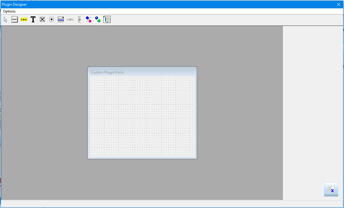
You will be given a blank form to start designing your plugin on. The Options menu allows you to save your Plugin Forms in a file so you can work on them later.
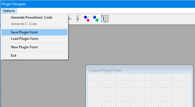
From the Options menu you can also load a form from a file, generate a New form and also when your form has been fully designed you can generate source code which will be copied to the Windows clipboard. Once your source code is in the Windows clipboard you can paste it into your programming language code editor.
Currently only Powerbasic code generation is supported, but a later version of NPBuilder will provide code generation in C (and possibly other programming languages).
The Visual Designer has a toolbar which allows you to select a Control type to draw on the form. Once you draw the control on the form it can be resized, moved or even deleted later.

The currently support controls you can put on your Plugin forms are (in order as shown above on Toolbar):
- BUTTON control (also an ownerdrawn version called ODBUTTON)
- LABEL control (also an ownerdraw version called ODLABEL)
- TEXT control (single line) (multiline control is called TEXTM
- CHECKBOX control
- OPTION control (also called RADIO)
- COMBOBOX control
- HTRACKBAR control
- VTRACKBAR control
- VECTOR control
- OPENGL control
- XMLTREE control
Future versions of NPBuilder may support other controls as well.
You can select a control with the mouse and it will display drag handles when selected. You can drag the control and resize it using the drag handles.
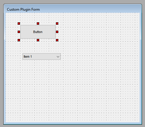
If you want to drag multiple controls at one time, then hold down the CTRL key when selecting the controls. Multiple drag handles which appear, one for each control selected.
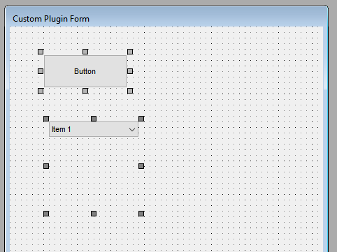
You may notice above the COMBOBOX control shows drag handles below the actual control. The height of a COMBOBOX control includes not only the height of the visible control, but also the height of how far down the drop down list will go when it is displayed. It is important to make sure you take this into consideration when sizing a COMBOBOX control.
To edit the properties of a control simply double click on the selected control.
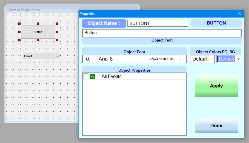
You can edit the controls Name, Text, Font, Foreground (FG) and Background (BG) colors and also what Properties you want for the control which usually effect its appearance or response to events.
Plugins support 14 builtin Fonts, so you can only use those provided fonts.
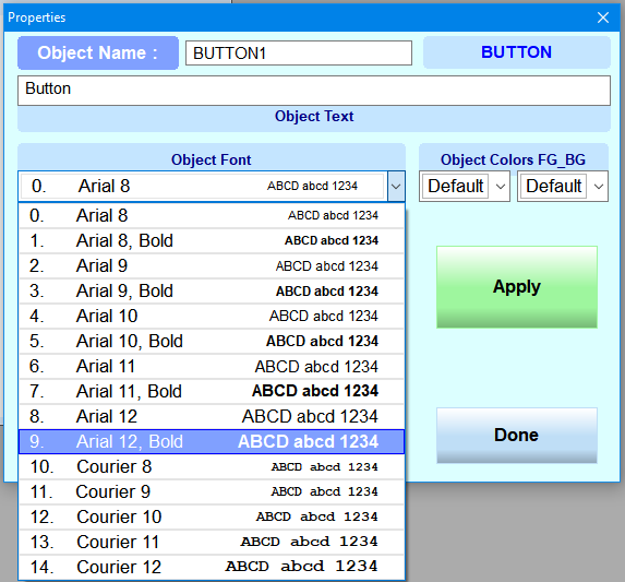
Plugins support 32 predefined colors for Foreground and Background.
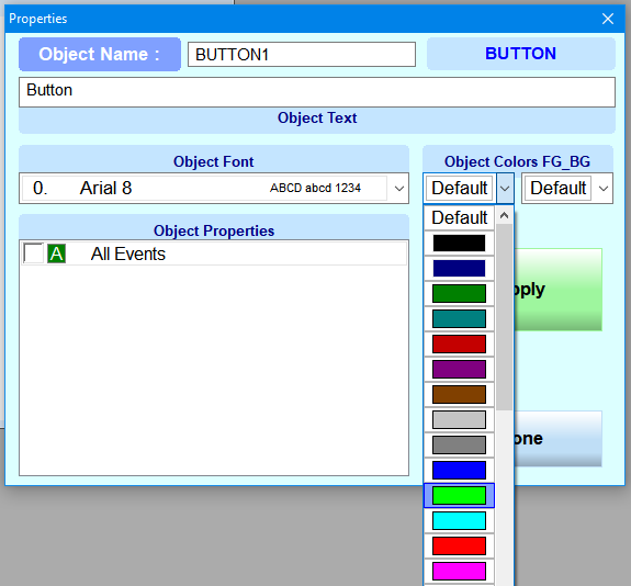
Some controls may not support colors (ie. BUTTON control must switch to an ownerdrawn ODBUTTON if you select colors other than defaults).
Currently it is expected that Plugins will be designed for the English language or possibly another language which is supported by the standard Roman character set. Plugins though do support translation features dynamically to other languages but this can only be done by using the Ownerdrawn version of controls. This is an advanced topic which requires working with the language files for NPBuilder and will be left for another future document to explain.
You can save your Form to work on later from the Options menu and when you are ready to generate the source code for your plugin simply select the "Generate Powerbasic Code" option from the menu.
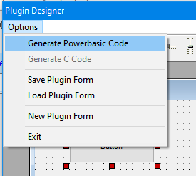
Once you generate your source code it can then be pasted from the Windows clipboard into your programming language code editor.
